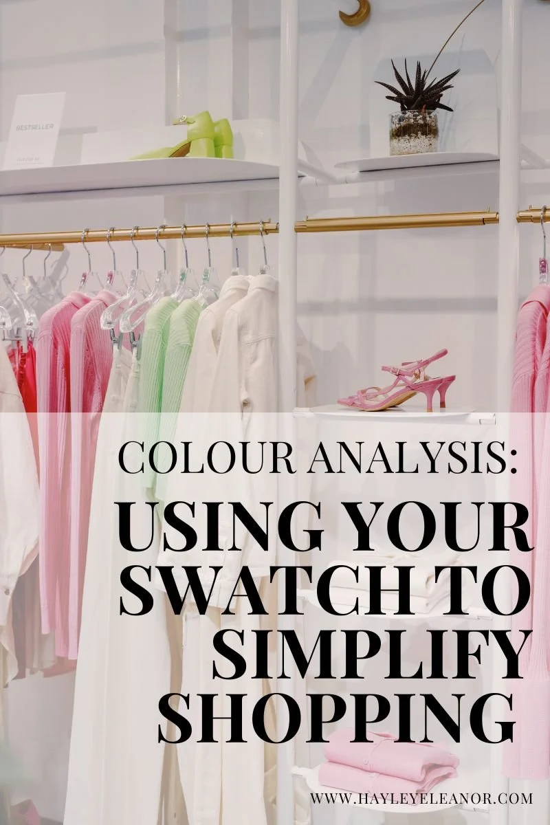
Colour Analysis: How to Use Your Swatch Without Overcomplicating Shopping
Colour analysis has had a huge resurgence in recent years- and for good reason. When you understand which colours truly harmonise with you, shopping becomes quicker, outfits feel more cohesive, and getting dressed feels easier.
I had my own analysis over 20 years ago, and I’ve been working with colour professionally for the last decade. I absolutely believe in it. But I’ve also seen how easily something designed to simplify your life can accidentally make it more complicated.
Your swatch should feel empowering- not restrictive.
Let’s talk about how to use it in a way that works in the real world.
The Purpose of Your Swatch
Your colour swatch isn’t there to police your choices.
It’s there to:
Help you edit quickly in shops
Guide you towards harmony
Stop you buying colours that drain you
Make your wardrobe coordinate more easily
It is not a paint chart that requires an exact match.
And this is where many women get stuck.
Why Exact Matches Rarely Exist
I often see women in stores holding garments up against their swatch, searching for a perfect match. The reality is- that perfect match rarely exists. Brands don’t dye fabrics to align with seasonal palettes. Different fabrics absorb dye differently. Lighting changes how colours appear. And there are countless “in-between” shades that sit beautifully within a palette but aren’t printed on your fan.
Years ago, when I first received my own physical swatch, I became slightly obsessive about matching it. I’d overanalyse, second guess, and often walk away from pieces that actually worked beautifully- simply because they weren’t identical to the sample. It slowed me down rather than helping me. That’s why I now prefer using digital PDF swatches alongside (or sometimes instead of) physical ones. Seeing the full palette together gives you a broader view. You can step back and ask: Does this colour harmonise with the overall feel of my palette? That question is far more helpful than: Is this an exact square on my fan?
Don’t Get Lost in Sub-Seasons
There’s a lot of information online about sub-seasons. Soft Summer. True Summer. Light Summer. And then tonal systems layered on top. Understanding your undertone, depth and clarity is useful. It builds awareness. But here’s the truth: If a pale peach suits you and a mid-tone peach also suits you… does it really matter which sub-category it technically belongs to? If it fits beautifully, aligns with your style, and makes you feel good- that matters far more than whether it’s labelled correctly on Pinterest. Theory is helpful. But theory should never override practicality.
A Real Example From the Shop Floor
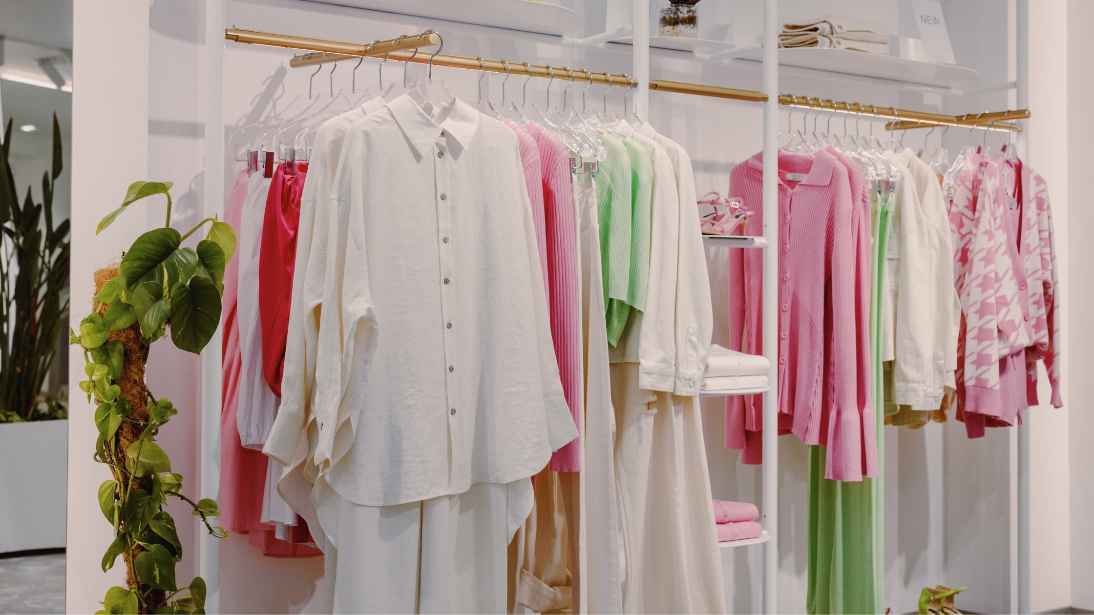
Recently, I met a lady who came to me with her brand-new Summer swatch. She was excited (understandably) and looking for a pink coat. A coat is a big purchase. And a pink coat is a statement. When we chatted, it became clear her natural style was more relaxed and casual. Not overly feminine. She liked ease. Subtlety. Effortless dressing. The pink coat was within her palette- but it didn’t feel aligned with her personality or the way she’d realistically wear it. Instead we chose the same coat in a softer green- still part of her palette, still flattering- but far more in tune with her style and much easier to combine with what she already owned. Then, rather than abandoning pink entirely, I suggested a smaller, more affordable pink top. Something she could experiment with. Something lower commitment. That’s a practical use of colour analysis. It’s not about forcing every colour in your fan into your wardrobe. It’s about using the palette wisely.
How to Shop With Your Swatch (Without Overthinking)
Here’s a more realistic way to approach it:
1. Think Harmony, Not Perfection
Does the colour sit comfortably within your palette overall? Does it look balanced against your skin? That’s enough.
2. Use It to Edit Quickly
If something is clearly too warm, too muted, too pale or too harsh- put it back. Don’t over analyse it. Most brands design in colour stories each season, so once you recognise the overall feel of your palette, you’ll quickly spot which sections are likely to work for you.
3. Prioritise Fit and Style
It is hard enough to find clothes that fit our bodies well. If something fits beautifully and feels like you, don’t reject it because it’s slightly lighter or deeper than your swatch square.
4. Match Commitment to Experimentation
Want to try a new colour from your palette? Start with a knit, a blouse, a scarf.
5. Let Your Personality Lead
Colour analysis supports your style. It doesn’t replace it.
The Real Goal of Colour Analysis
The goal of colour analysis isn’t to create restriction.
It’s to:
Reduce overwhelm
Improve coordination
Help you feel more confident
Make shopping simpler
If you ever find yourself frozen in a fitting room because a shade isn’t identical to your swatch- that’s your sign to zoom out. Ask:
Does this work with my colouring?
Does it work with my wardrobe?
Does it feel like me?
If the answer is yes- that’s enough.
Simplify Your Shopping with Colour Analysis
Colour analysis is a fantastic tool for simplifying your shopping experience, but it’s important to approach it with flexibility. Your swatch is there to guide you, not restrict you. Focus on how colours harmonise with your palette, rather than obsessing over finding an exact match. The ultimate goal is to create a wardrobe full of pieces that work well together, reflect your personal style, and make getting dressed a breeze.
Colour analysis is a brilliant tool. But like all tools, it works best when used with flexibility. If you’d like support discovering the colours that genuinely work for you- in a way that feels modern, wearable and realistic- I offer in-person Colour Analysis appointments in Nottingham.
Related Articles You May Find Helpful:
Will My Colour Season Change As I Age?
What’s the Difference Between Colour Analysis Systems?
The Basics of Colour Analysis
Using Colour Analysis to Create Outfits
Pin this to your Pinterest board so you can find it again later: